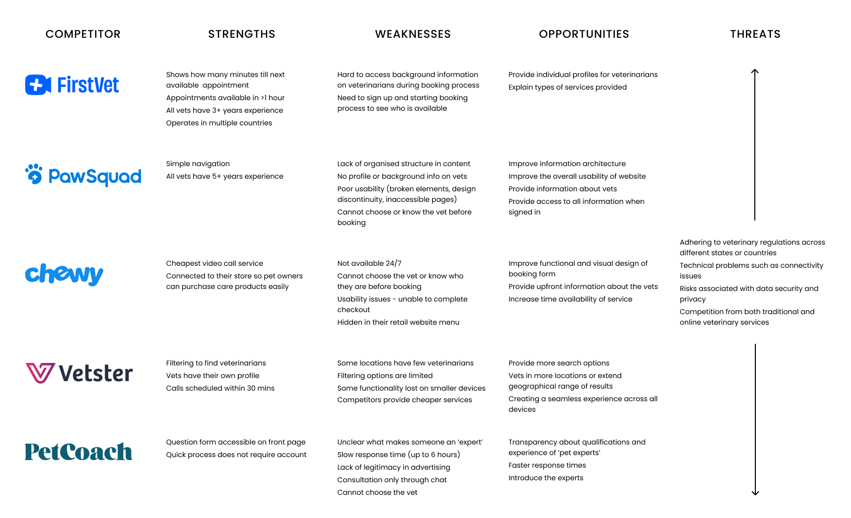
User Survey Insights
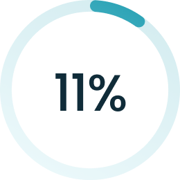 2 out of 18
had experience with online vet care
2 out of 18
had experience with online vet care |
 16 out of 18
would consider using online vet care 16 out of 18
would consider using online vet care |
 15 out of 18
faced in-person vet visit issues 15 out of 18
faced in-person vet visit issues |
 3 out of 18
struggled to find a specialist vet 3 out of 18
struggled to find a specialist vet |
User Interviews
Details
I interviewed four participants ranging from 25 – 60 years old and located in the US or Europe online via Zoom.
Research Goals
- Understand the challenges pet owners face with veterinary care
- Determine the perceived benefits and drawbacks ofonline pet care
- Determine the features pet owners expect to find in a veterinary care app
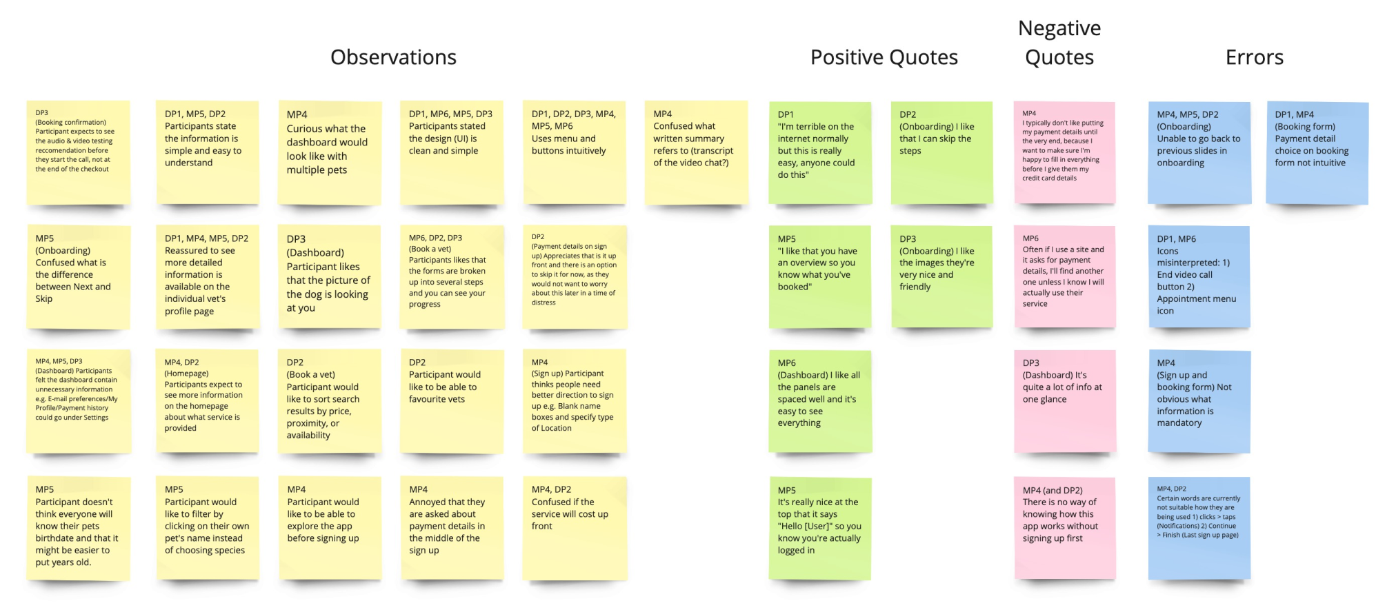
Affinity Map
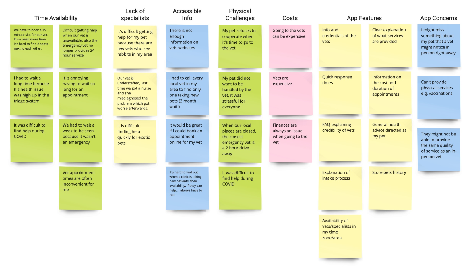
Key Insights
- Limited availability of vets including: inconvenient appointment times, long waits, and limiting time slots.
- Physical challenges including: uncooperative or anxious pet, long travel times, and COVID-19 restrictions.
- Shortage of specialists for exotic pets.
- Lack of online information such as pricing and services offered.
- Concerns of low quality or limited services relative to in-person vets.


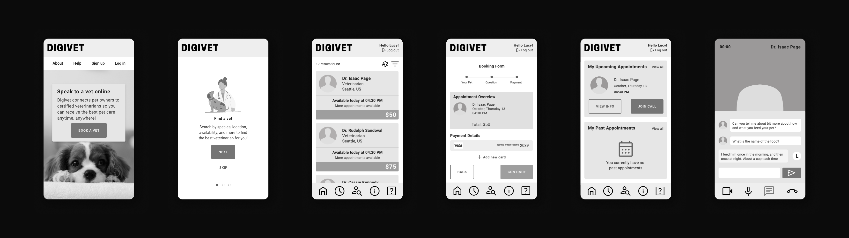
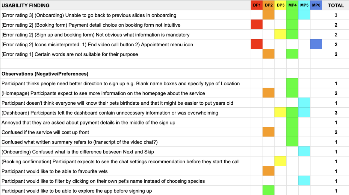
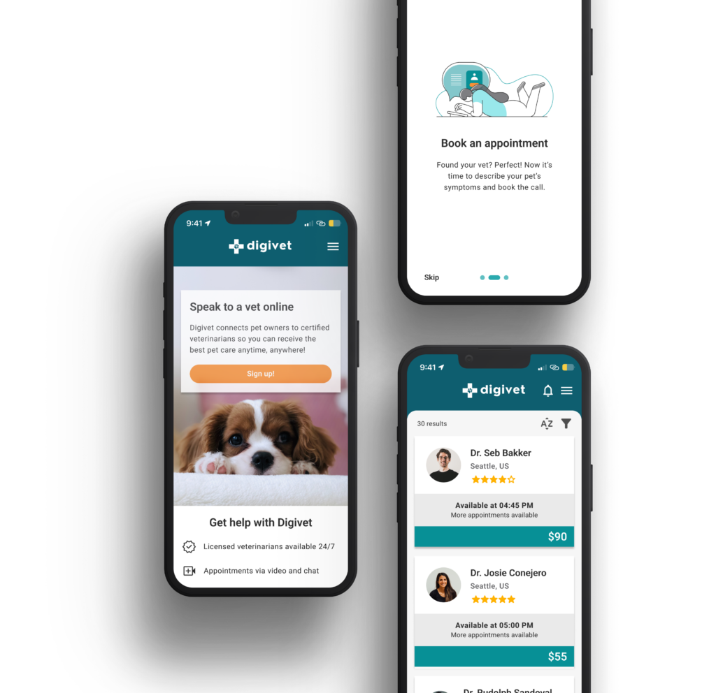
Usability Test Design
Objectives
- Observe how easily participants complete three tasks in the prototype
- Observe how participants navigate in the app
- Observe participants thoughts and feelings whilst completing the tasks
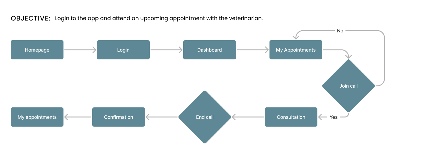
Tasks
- Create an account
- Book an appointment
- Attend appointment
Metrics
- Learnability was measured by the success rate of user tasks
- Usability errors were categorised according to Jakob Nielsen’s rating scale
- Qualitative observations and feedback from the participants were documented
Analysis
Overview
All participants completed the tasks successfully and found the app easy to use and navigate. Some participants took longer to complete tasks due to the errors mentioned below and their feedback indicated the dashboard required revision.
Aggregate
Prioritise