Rayne Leroux

Flexifit

A personalised fitness app offering a wide selection of workouts and tracking to keep users motivated and maintain their routine.

Time:

Feb ’23, 1 month

Scope:

Responsive app design

Role:

UI Designer (Personal project)

flexifit-hero-image

THE PROBLEM

Achieving health and fitness is a common goal but maintaining motivation and consistency in an exercise routine poses challenges for many individuals.

THE SOLUTION

Flexifit supports individuals in embracing fitness at home by providing personalised routines and advice, workout scheduling, and progress tracking.

Understanding the User

Upon receiving information about the primary user, I created the persona Rebecca to present her goals, frustrations, and needs when starting and maintaining a exercise routine.

USER STORIES and FLOW

I was provided user stories which gave me a deeper understanding of Rebecca’s needs and guided my design for a user flow to define the architecture of the website.

User Stories

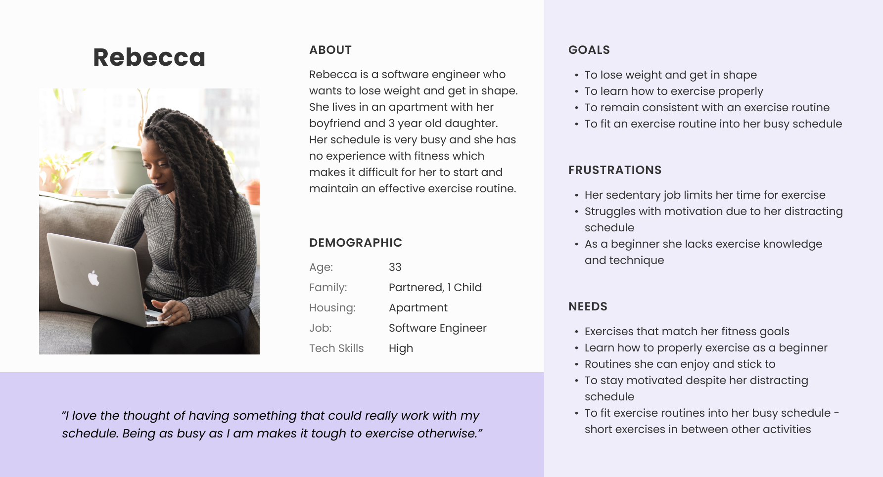
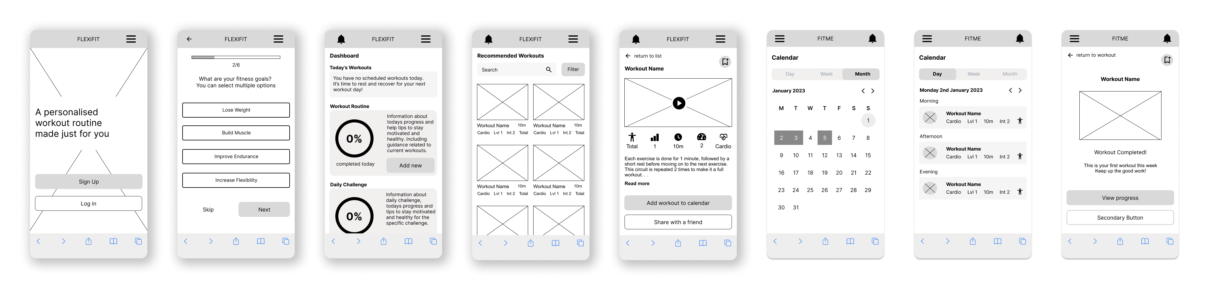
As a new user I want to …

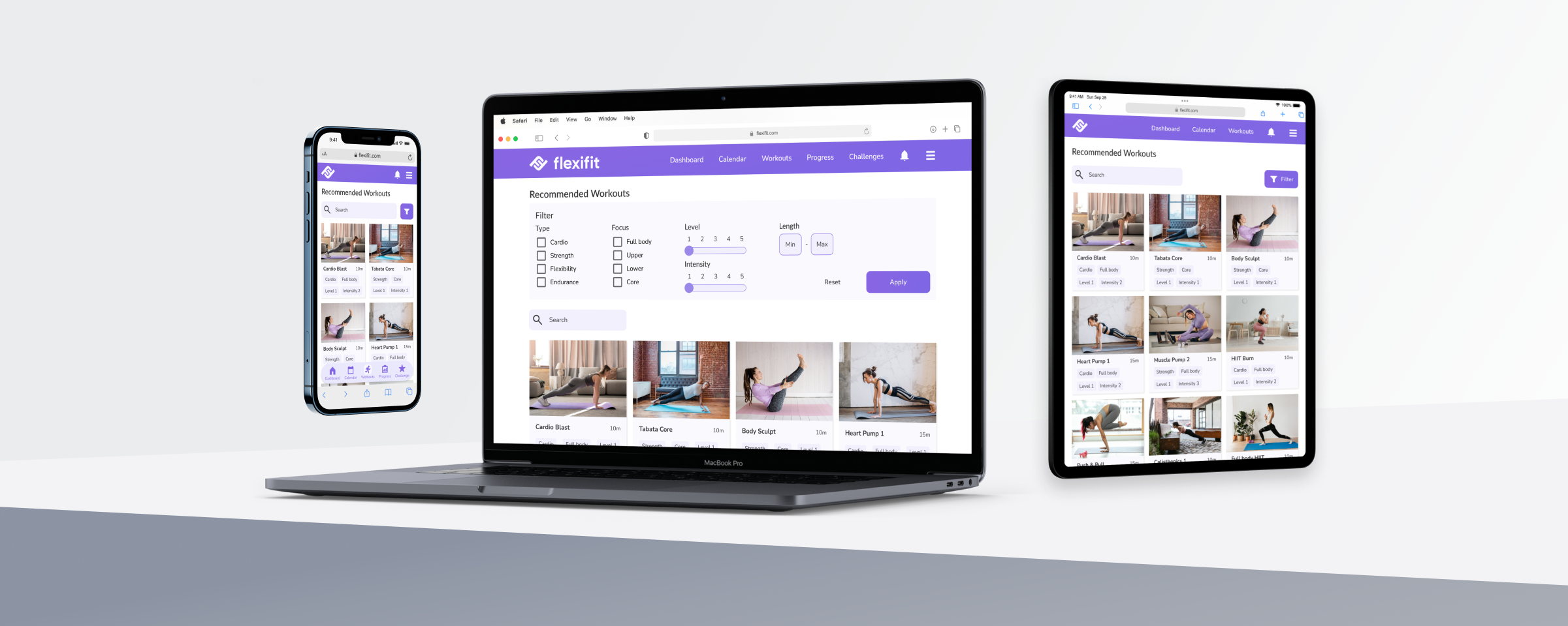
  • learn about different exercises, so that I can figure out what is best for me.
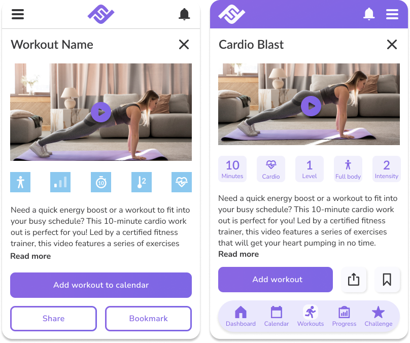
  • be shown how the exercises are done, so that I know I’m doing them correctly.

As a frequent user, I want to …

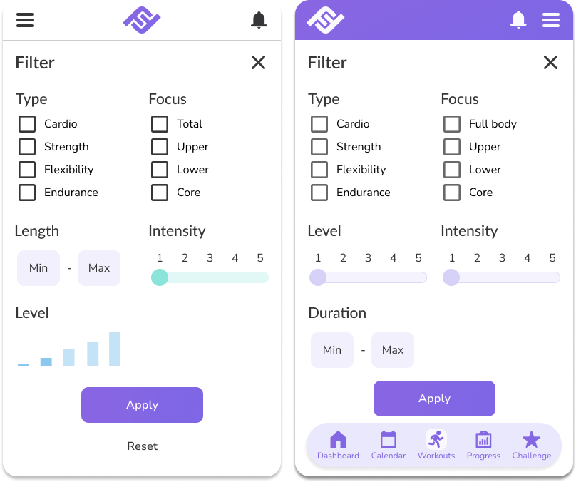
  • be able to schedule exercises for working out, so that I build positive habits.
  • be able to earn achievements or rewards, so that I can stay motivated.
  • complete daily challenges, so that I can have an additional way to stay motivated.
  • track progression and record what I’ve done, so that I can see my progress over time.
  • be able to share routines with my friends who may also be interested, so that I can encourage them to become healthier.

IDEATION

Applying a mobile-first approach, I sketched wireframes for the primary user flows through the Crazy 8 method. Subsequently, I translated these concepts into a mid fidelity prototype using Figma.
Paper with rough sketches of wireframes
A row of mid fidelity wireframes of the app based on the previous low fidelity sketches.

visual identity

To define Flexifit’s visual identity, I curated a moodboard tailored to our primary user by opting for calm light colours, a simple minimal design, and a positive mentality towards fitness. Based on this, I created a style guide to ensure consistency in the high fidelity prototype.

IMPLEMENTING FEEDBACK

Utilising the style guide, I began creating high fidelity wireframes. During this process, I gathered feedback to improve the design and make the following revisions:

#1: A bottom navigation bar was added to improve usability for mobile users.

#2: The number of colours was reduced to create balance and clear hierarchy of elements.

#3: Buttons were redesigned and the number of icons reduced to create a cleaner UI.

THE FINAL PROTOTYPE

Using the wireframes, I built a high-fidelity mobile prototype. I created some wireframes for mobile, tablet, and desktop to display the responsive design of the app.

A mock up of a Flexifit wireframe on a mobile phone, laptop, and tablet.

CONCLUSION

NEXT STEPS

If I were to continue this project, I would conduct usability and preference tests to validate and improve the current design, as well as surveys to gain insight into the brand perception of Flexifit.

LESSONS

🎨 Inspiration is everywhere

Previously, I sought inspiration from similar media to what I was working on. Moving forward, I will draw inspiration from a diverse range of mediums.

⚖️ Balance is key

I struggled to use multiple colours in the high-fidelity wireframes but I learned to achieve balance by minimising the number of colours and utilising shades.

✏️ Sketch before digitising

Initially, I skipped sketching screens similar in content before digitising. Revisiting sketching for these would have helped me ideate more freely. I will sketch more extensively in my future projects.

Scroll to Top